All work
All work
Digital
Assessments
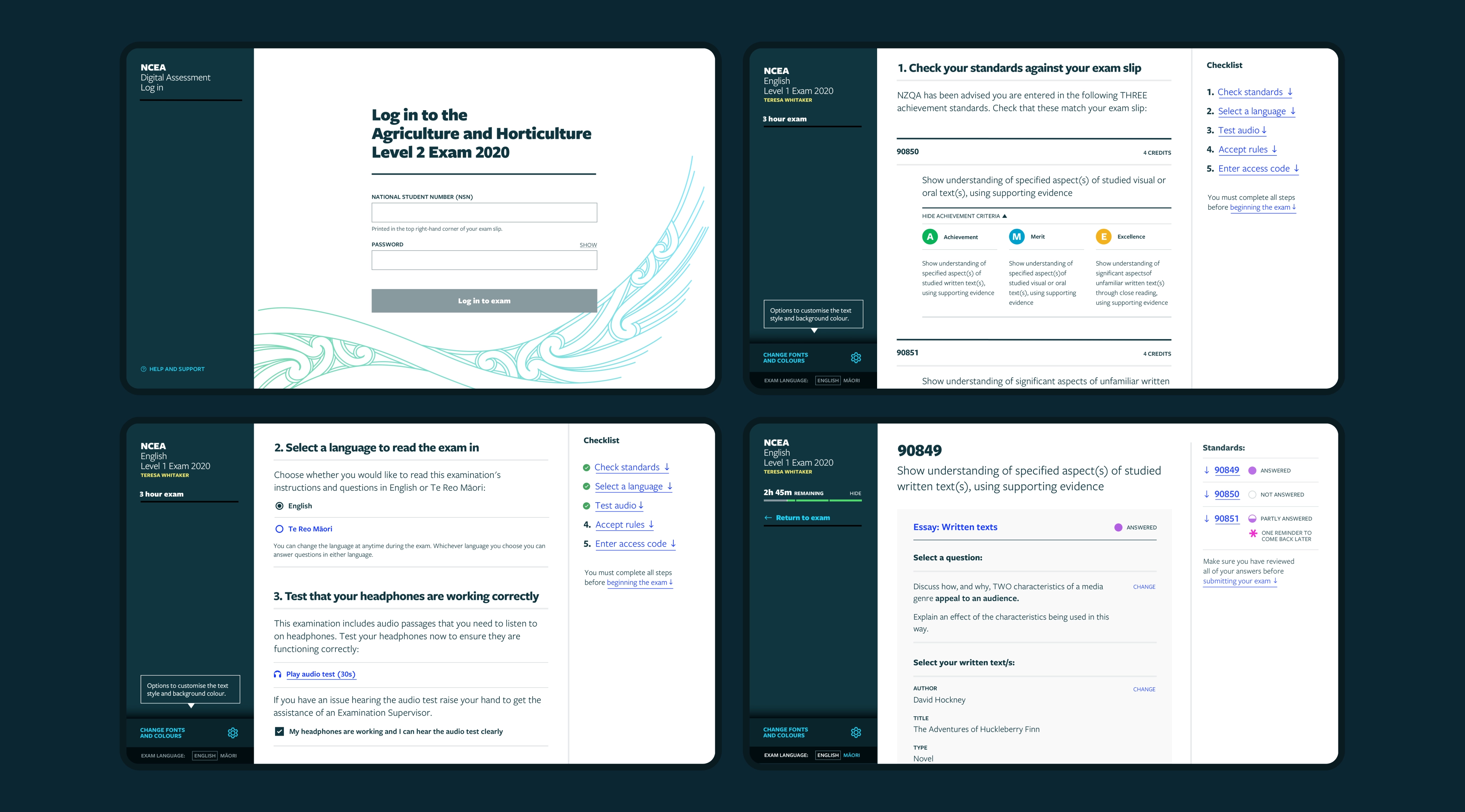
An assessment interface designed to enable secondary school students to sit their examinations digitally, replacing traditional paper format exams.
( AGENCY )
Chrometoaster
( CLIENT )
NZQA
( Role )
Visual / UX Designer

( THE MISSION )
To re-design secondary school exams by shifting from the traditional paper format to a digital-first approach. To achieve this we set out design an accessible system that focused on students needs, and to provide a foundation for the digitisation of additional assessment subjects in the future.
( DISCOVERY )
From paper to pixels
The discovery phase of this project saw exam papers across an array of subjects torn to pieces, literally. Chopping up the existing paper exams allowed the team to identify key and repeating content structures that make up the foundation for an assessment, as well as bringing inconsistencies to the surface.
Once the key patterns were identified and distilled, we created a system of digital components to enable editors to craft exams in a structured and consistent way.

( TASK STRUCTURE )
Breaking it down
After the existing exams had been dissected and distilled, a core pattern for an assessment task was broken down into four parts: The core task, task context choice, task considerations, and the answer. Each of these parts consists of a range of components to allow for flexible exam configurations catering to a variety of subjects and contexts.

( DESIGN SYSTEM )
Accessibility first
To build a consistent and scalable interface, we designed a comprehensive design system that was robust enough to cater for an extensive range of component configurations. Using a well defined content structure as a foundation, we designed an extensive component library using a slightly modified version of the NZQA brand as a visual guideline, ensuring that accessibility was of the highest priority across all components.


( User INTERFACE )
Designing for crisis
It’s no secret that examination time is a stressful moment in a students life, and this became our ethos when approaching the interface design. Workshops and testing with students provided helpful insights that led to an interface where students have control over how much they see in view at any time, allowing for a focused experience with additional functionality and content just a click away.

( MEDIA )
Viewing resources
Resources are an important aspect of a students assessment. They are sources of information that need to be studied and interpreted by the student and exist in a variety of digital formats. My team designed a layout that allows the user to quickly shift focus from questions to resources, an array of components to account for multiple media types, as well as a focused view where a resource can be examined in detail with no distractions.


( FEATURES )
Highlighting &
Notetaking
In the absence of paper and pens, it was important to digitise analog methods used in exams like highlighting and note-taking, that assist students in the process of analysing information and completing tasks. This feature was designed to be unobtrusive and easy to use to ensure that no time gets wasted.

( Customisation )
Flexible & accessible
The interface offers a small amount of customisation to allow students to adjust visual aspects of the interface to suit their needs. The ability to change the font size, background colour can greatly impact a students ability to process information quickly.


( TESTING )
Validated by students
On top of user research, a variety of workshops were run with secondary assessment and digital transformation teams, and prototyping and testing was completed with secondary school students to validate the design.

