All work
All work
Design
Assembly
A robust and theme-able design system for delivering high quality, public sector websites.
( AGENCY )
Chrometoaster
( CLIENT )
Chrometoaster
( Role )
UX/UI Designer
( THE problem )
Creating government websites with Silverstripe CMS presents digital teams with a variety of obstacles. Varied, inconsistent approaches used across the industry have caused fragmented and suboptimal user experiences. The reliance on costly, one-off solutions to solve similar design problems, and address similar content and user requirements has only contributed to the overall inconsistency and lack of quality in the final products.
( The solution )
A design system for the people!
Our solution was to create a highly configurable, theme-able and data driven out-of-the-box website as a service, driven by a design system that encapsulates best-practice and accessible web design, addressing common content and IA requirements and empowering internal teams to quickly design and ship consistent, reliable and tested web products. Let’s break it down!

( requirements )
The first step was to identify the negotiable for the system, a set of requirements that would become the core drivers for the design and research:
- Accessibility
- Visual design control
- Maximum configurability
- IA flexibility
- Dynamic, taxonomy driven

( Research )
Identifying key components and patterns
Next up was to look at our existing designs and codebases that fall into the public sector category, identifying patterns and components from all that existing good work that are the most vital to the delivery of best-practice UX/UI design. What purpose do each of these serve in context of the wider system, and how do they address the wide range of content design challenges inherent in government websites?

( Foundations )
It all starts in Figma
Figma is a key artefact for designing and documenting the system, with tokens and component architecture that act as an accurate representation of FE and CMS capabilities. The file also needed to be designer and organisation-friendly, allowing intuitive translation of a brand into a token-based template thats ready to design with, and include detailed documentation and styleguide.

( Theming )
Tokens, & more tokens…
To drive the system, and to ensure alignment between design and engineering, I implemented a system of design primitive and semantic design tokens that could be used to theme the interface that directly reflect CSS of the live product. By visually representing this in Figma, designers are able to showcase their organisations brand by quickly theming the interface using variables, while ensuring that the constraints of the configuration settings in the CMS.
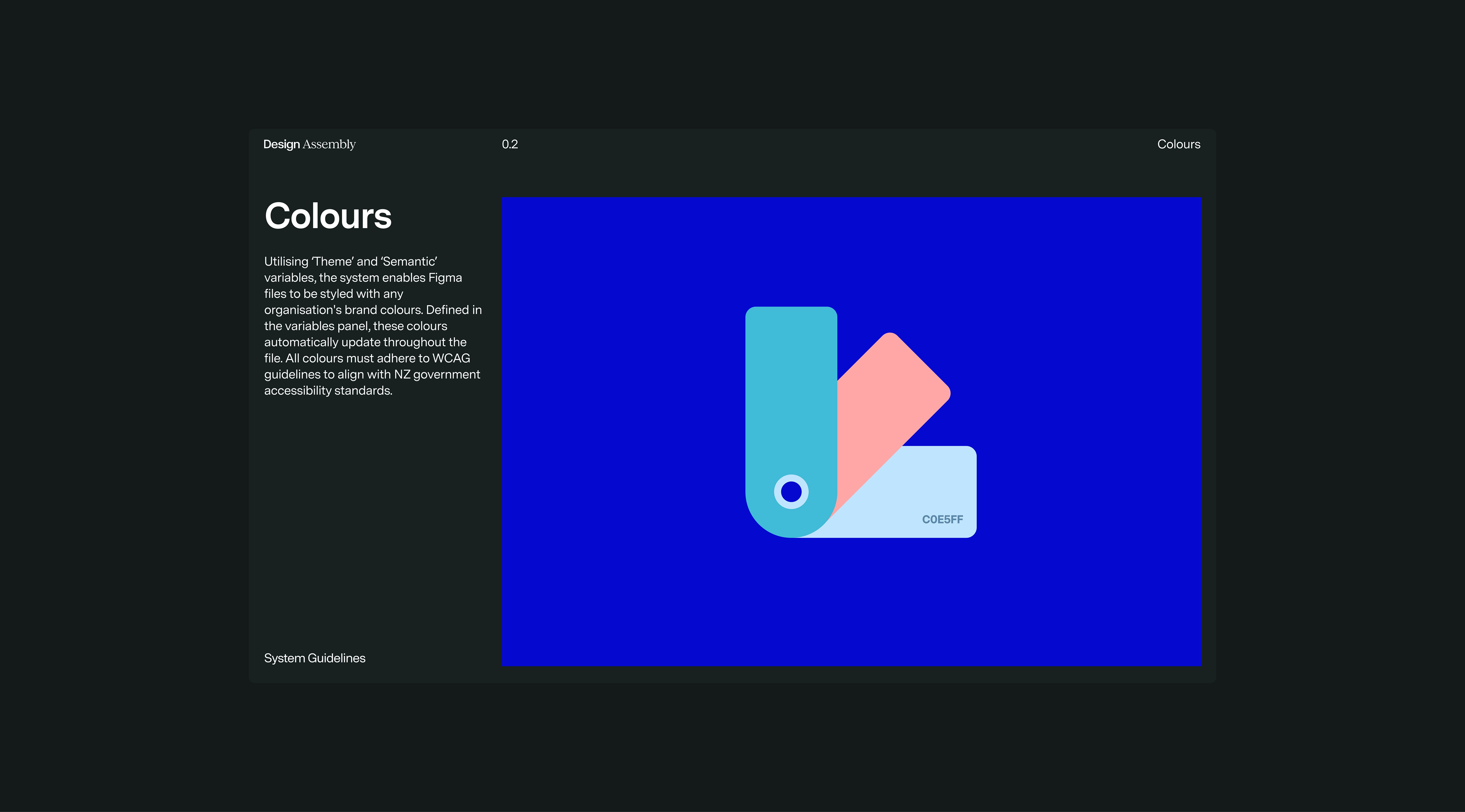

( Theming )
Colour
We utilise the combination of primitive and semantic variables to roll colour through the components of the system. The primitive variables act as a sort of placeholder for the organisations brand, where the semantic variables represent different functional contexts within the interface.


( Theming )
Typography
Typography is broken into two distinct categories. General content, for general content styles such as H1, and paragraph and UI text which is used primarily as the workhorse for component design. Each style is a combination of a range of primitive variables representing various typographic attributes.


( Structure )
Anatomy of the system
A working and understandable grid system is imperative to good design practice. Documentation of the grid and layout options helps new designers understand the possibilities and constraints of the system, aiding the content and UX design process.

UI Elements
UI Elements, comparable to "atoms" in the atomic design approach, represent the simplest, indivisible parts of an interface, such as buttons or input fields. They serve as the foundational building blocks for creating more complex components.
Site-wide components
Designed for global use, Site-wide Components appear across all pages and are critical for functions like navigation and site-wide alerts.
Template components
Template Specific Components are optional page components that are configured at the template level. These are always displayed at a set position in the page hierarchy and cannot be adjusted by the admin.
Content blocks
Content blocks are flexible, optional elements that can be added to a page to suit a variety of use cases. They support diverse layouts, visual styles, and varying levels of imagery and interactivity based on user and content requirements.


( Layout)
Dynamic, searchable content and flexible IA
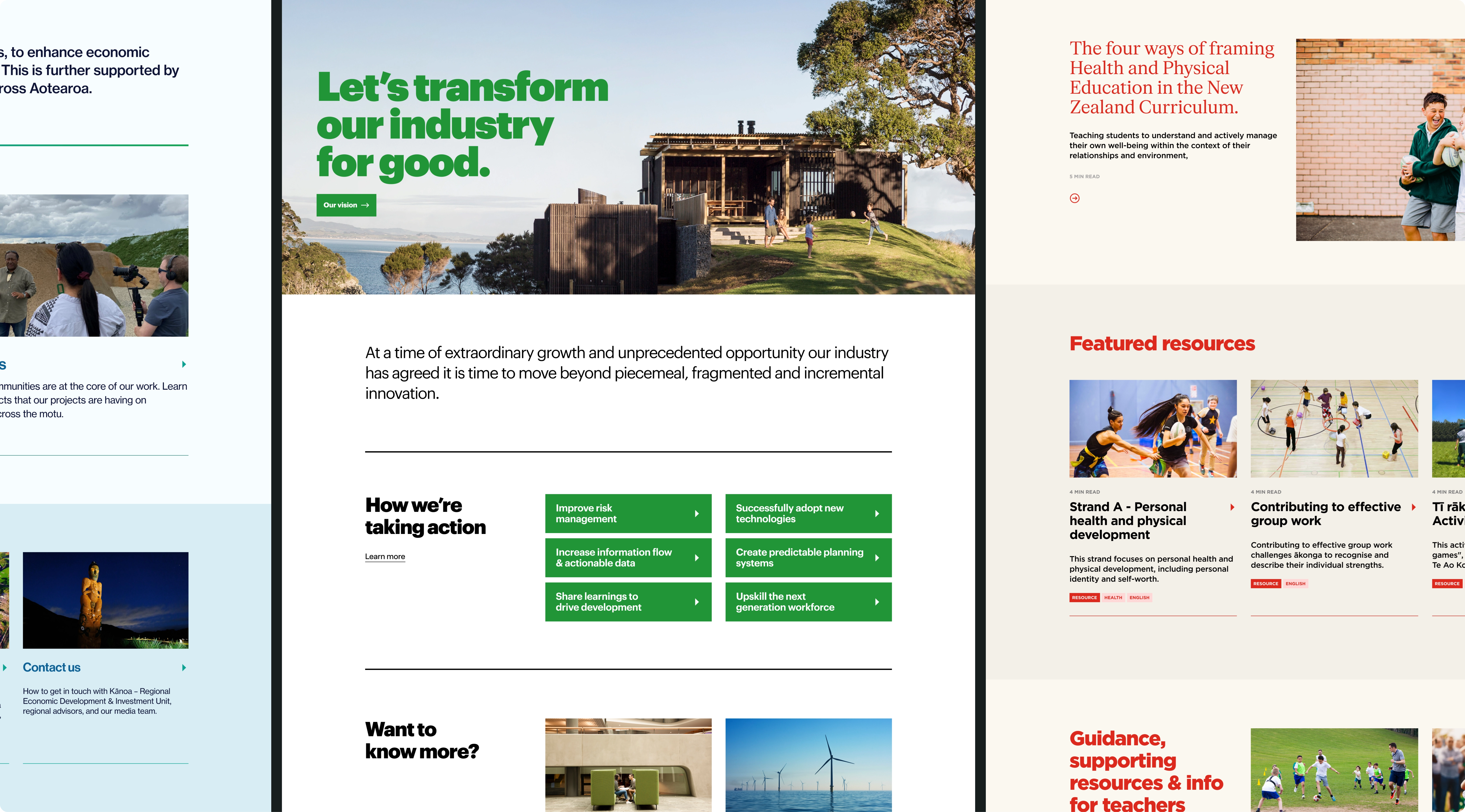
Content management needed to be super dynamic, discoverable and flexible. Chrometoaster developed an advanced taxonomies module based on out-of-the-box Silverstripe taxonomies, allowing for semantic content modelling, management and facilitating a range of IA frameworks. We created Advanced List of Things (ALOT) content block to display dynamic content in a modular fashion across the site.


( EXamples )
Putting it all together
This solution offers public sector teams and digital agencies a reliable way to rapidly develop feature-rich websites. By focusing on shared requirements and common functionality, it prevents the waste of time and resources on redundant tasks. As a result, teams can stay within budget without sacrificing high-quality user experiences.